Pactive — Powering
a Sustainable Future
The Project
Pactive, a sustainability and energy solutions company, combines passive and active strategies to create more sustainable buildings and operations. The rebrand positions Pactive as efficient, up-to-date, and confident, while making its technical expertise feel more human and approachable. Built around the idea of “Enduring Value,” the brand looks towards a smarter, more sustainable future.
The Design
The visual identity is clean, precise, and structured. The minimal
wordmark uses + and − forms inspired by positive and negative
electrical polarities, reinforcing the concept of maximising impact
while minimising footprint. These symbols extend into a flexible
graphic device and set of patterns, with scalable variations designed
for different applications.
A predominantly black and white palette creates a rational,
adaptable foundation, helping minimise the
brand’s footprint across digital and print media, while bright
yellow brings energy, optimism, and a distinctive point of difference.
Warm, focused photography balances the technical nature of the
identity with a more human and approachable feel.
My Role
Contributing as part of the design team across:
- Competitive audit & opportunity mapping
- Conceptual exploration
- Visual language development
- Brand applications
- Visual asset & application animation
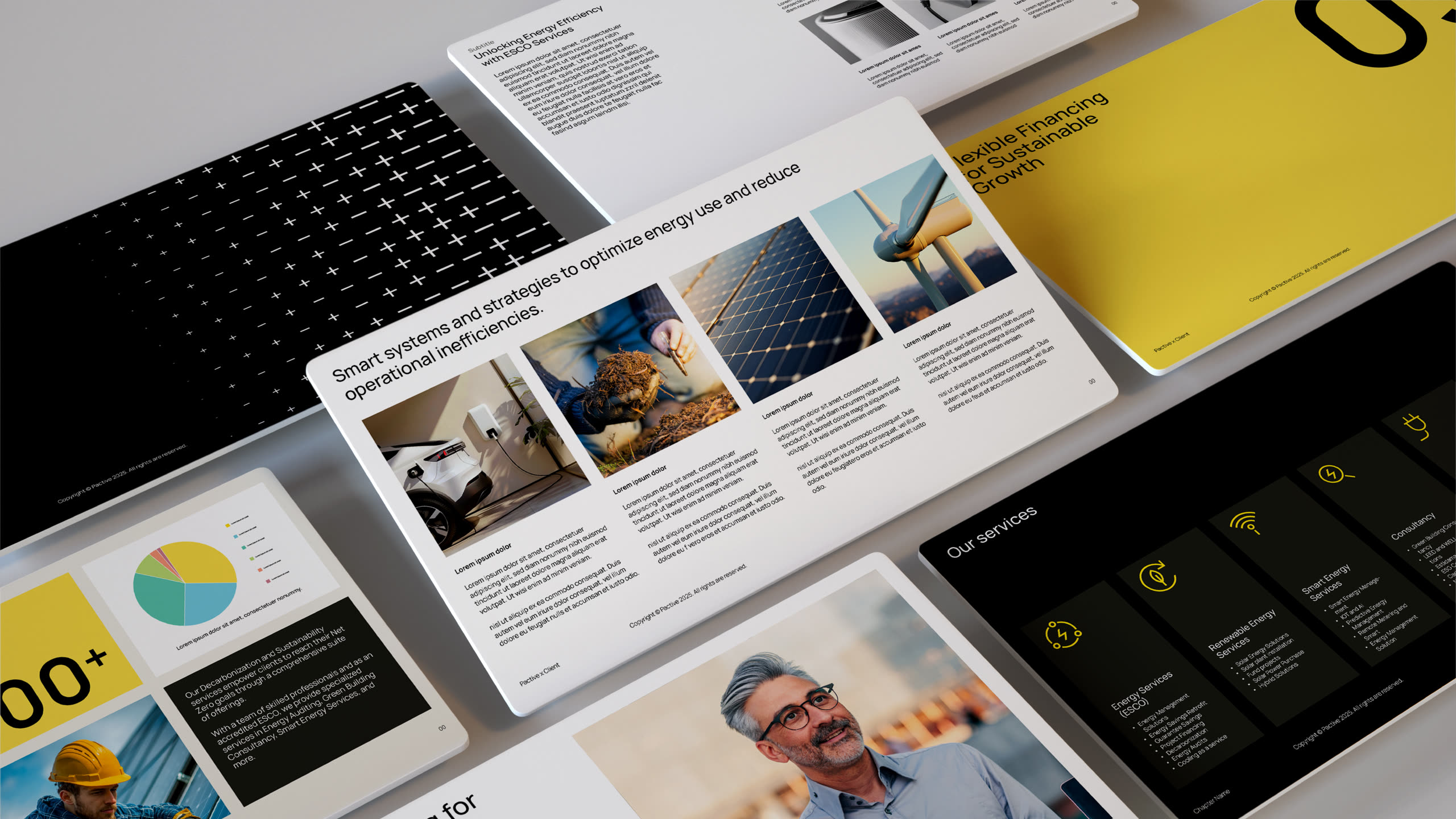
A system that is structured, precise, and scalable.
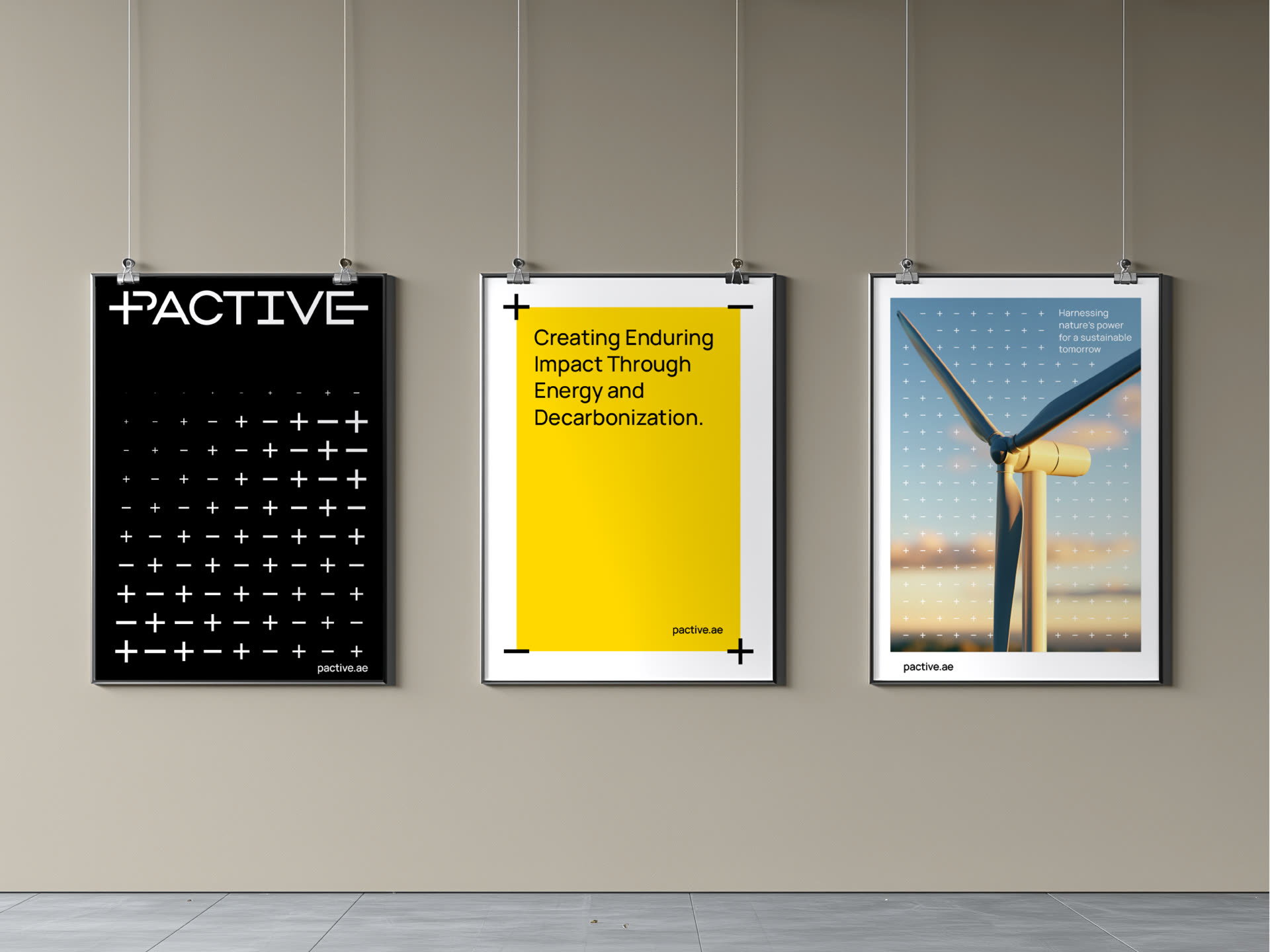
Graphic Device
The graphic device is a flexible pattern derived from
the plus (+) and minus (−) signs within the brandmark.
It takes three forms across the identity: a frame
device that highlights key messages or imagery,
a dynamic pattern that adds movement and rhythm
to layouts, and an overlay that creates depth and visual
interest when layered over imagery.

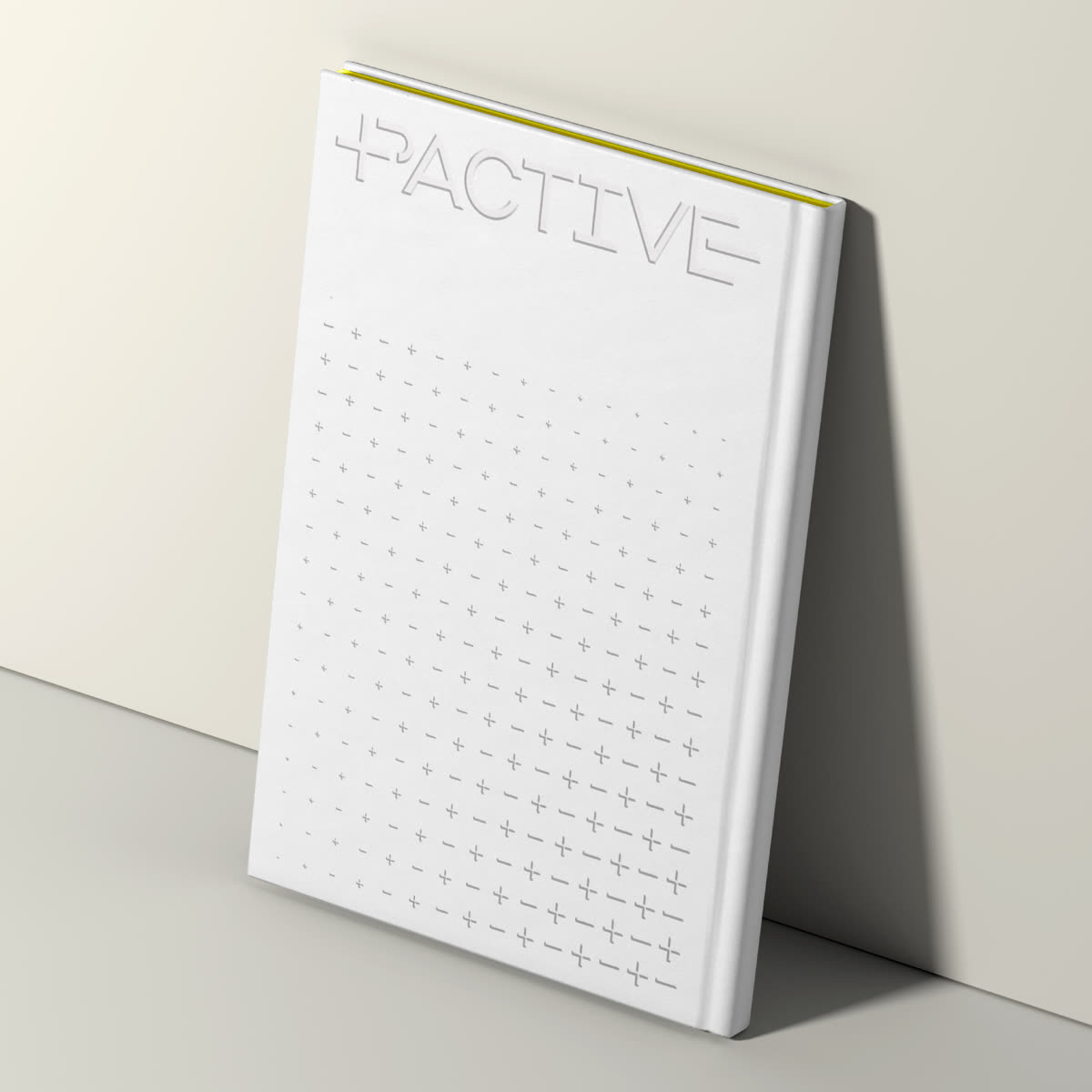
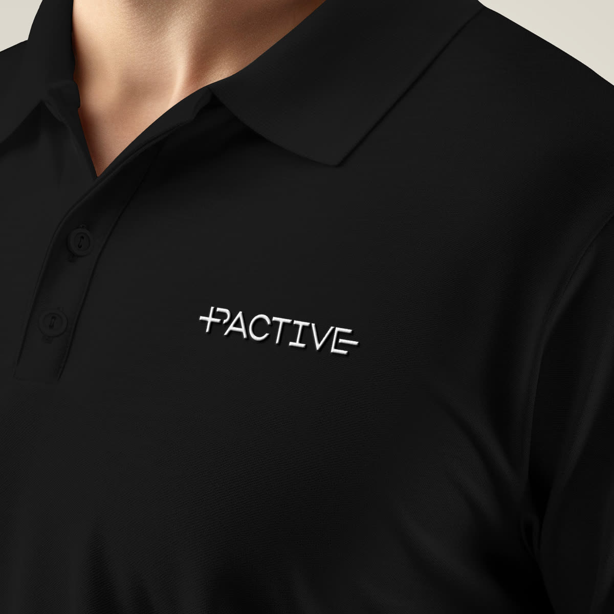
The identity across digital, stationery, and uniform.
Maximum impact, minimum footprint —
translating efficiency into a visual language.
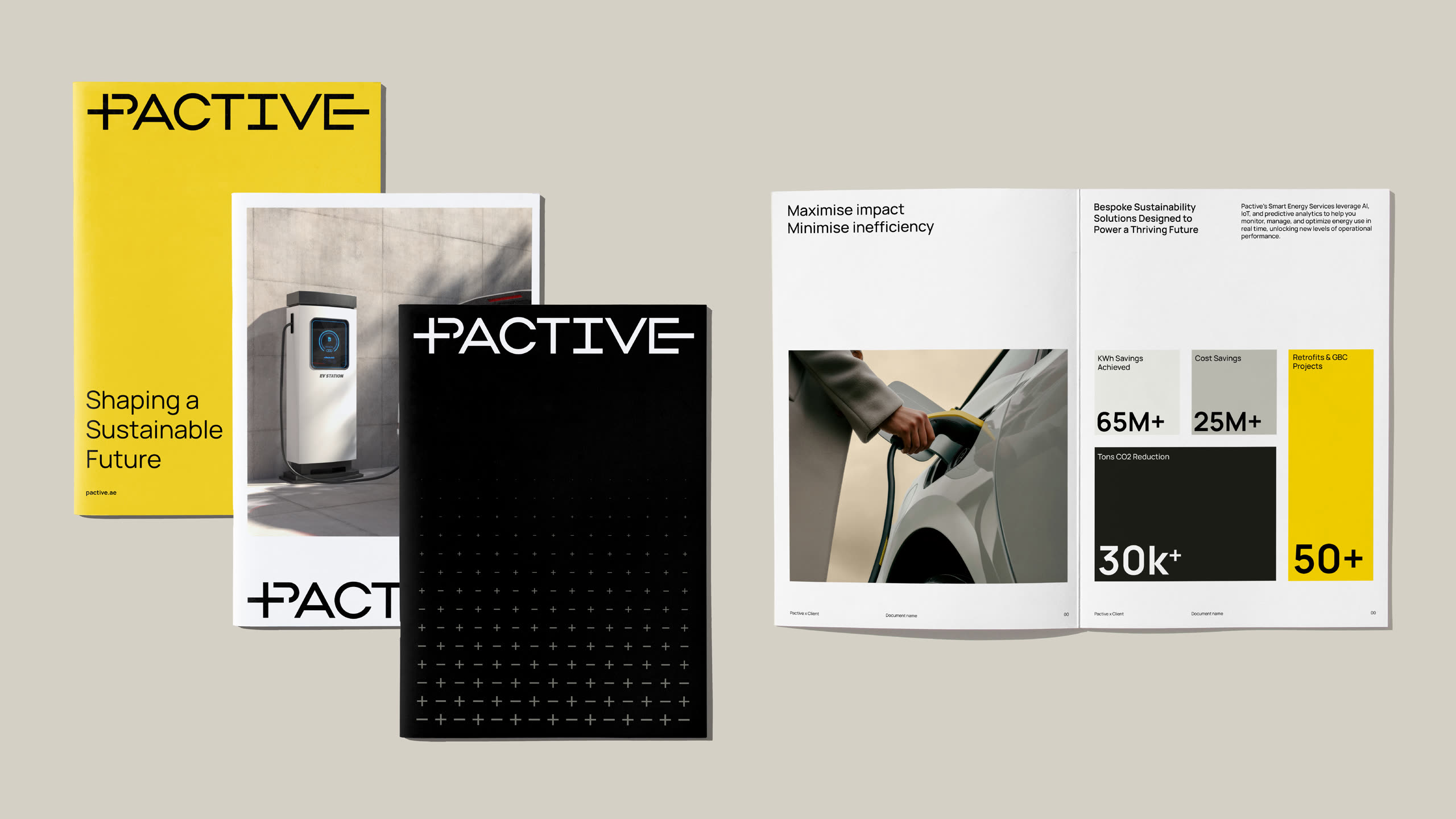
The system in application — structured,
adaptable, and designed for clarity.
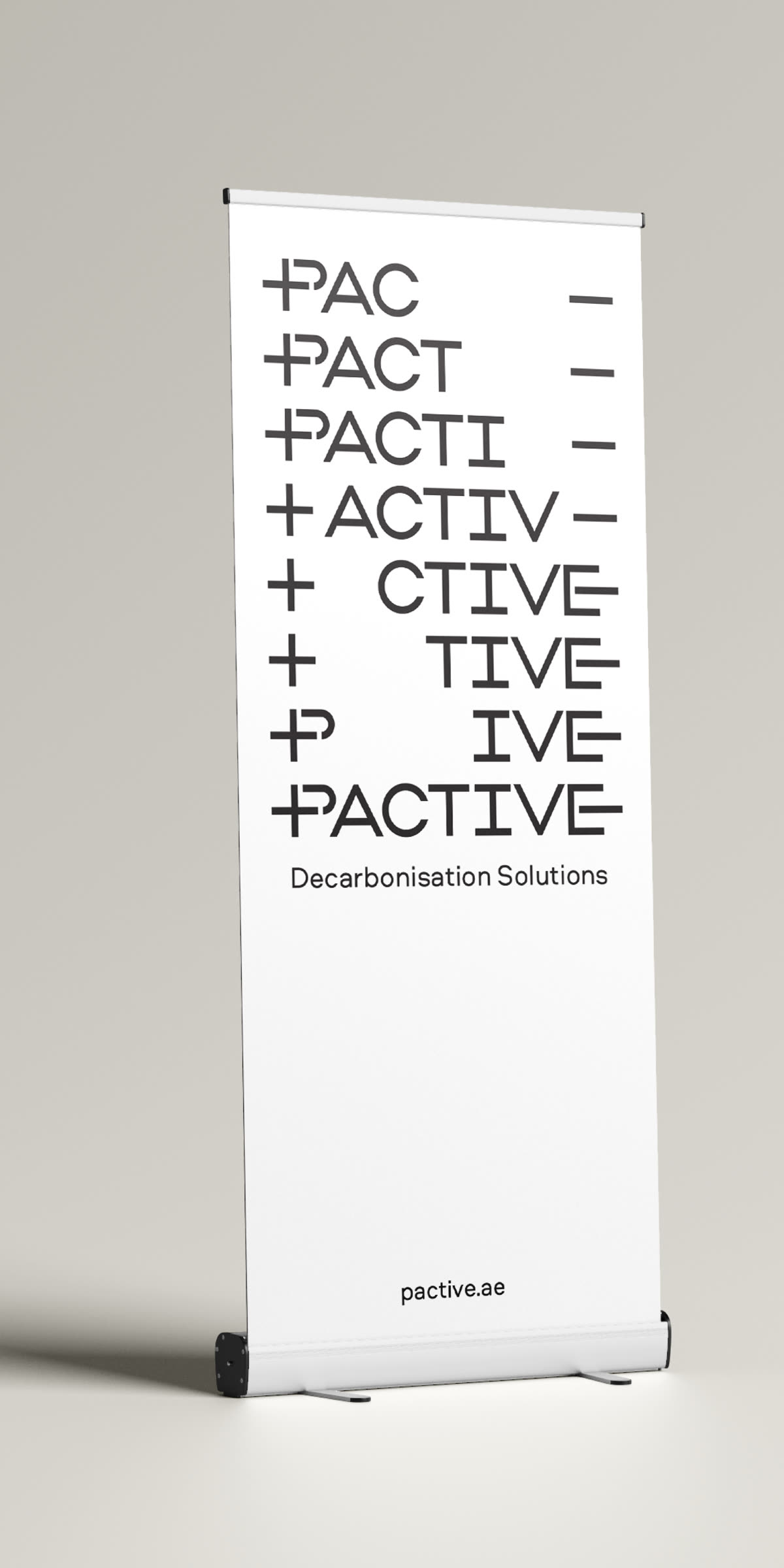
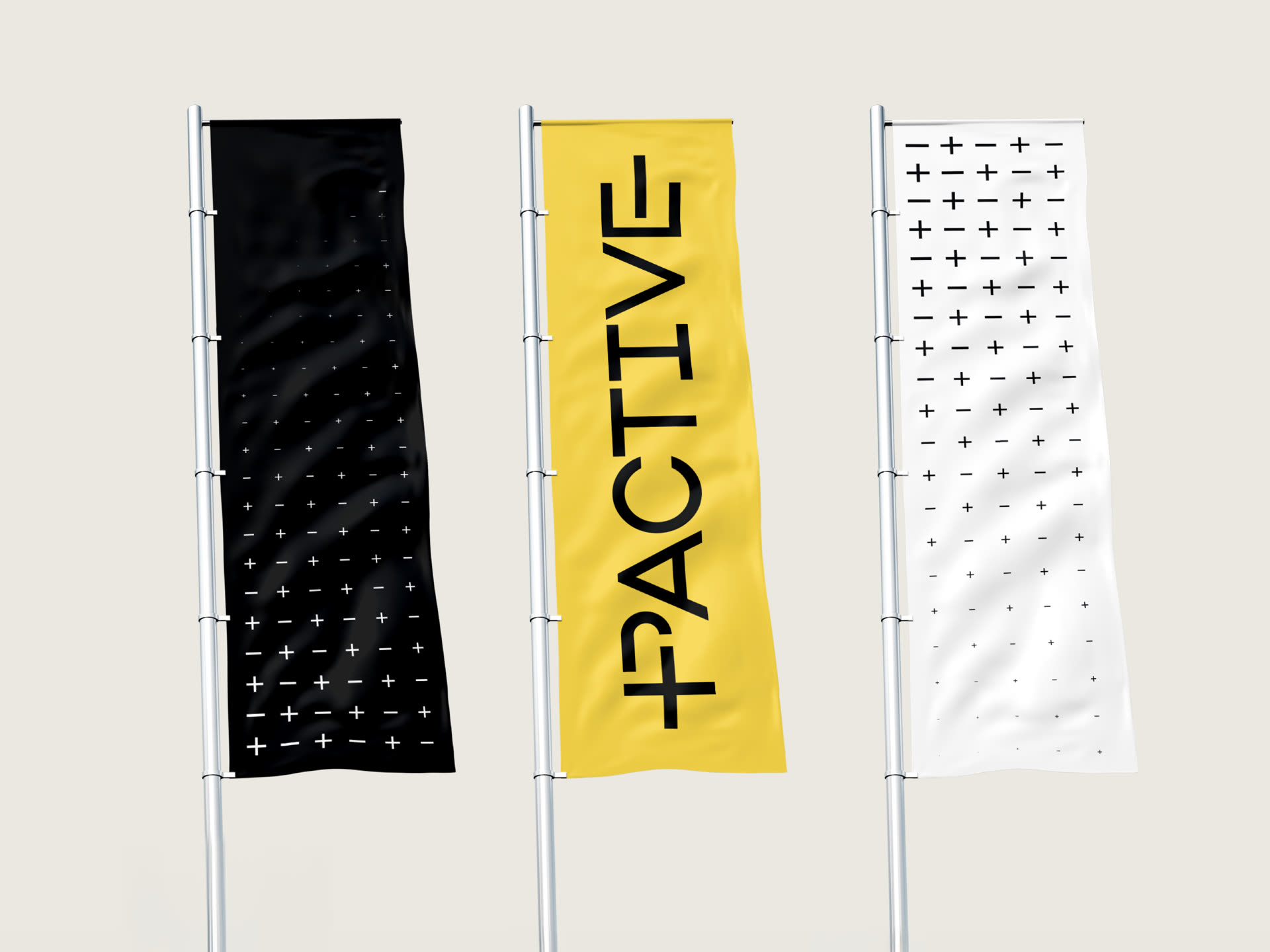
Adapting across different formats.